If you’ve been on our platform in the last couple days, you’ve noticed that we got a platform refresh! As a small nonprofit organization entering a space with many VC-backed edtech companies, it is always exciting when we can streamline the edtech side of things to be more user-friendly and helpful for our teachers and students. It’s always for the mission!
I wanted to take today to highlight some of these new changes for those teachers wondering about the changes. Let’s explore!
First, the teacher portal:
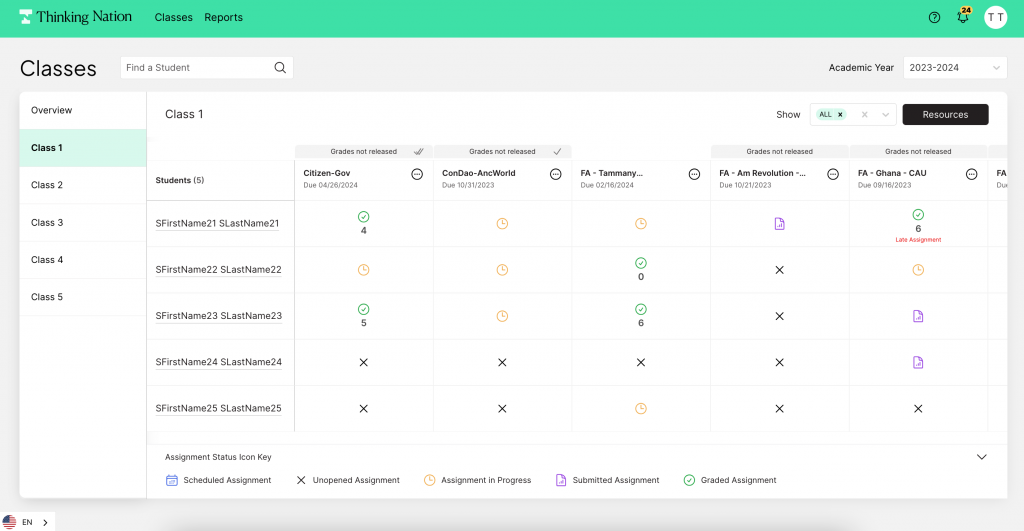
In addition to making the look feel cleaner and more intuitive, there are minor adjustments for teachers. For instance, the Icon Key is now on every page at the bottom, but with the option to minimize it to have more room to view your rosters.

Also simple changes, like the icons matching our brand colors have been updated, too. It’s the little things for this little organization, folks!

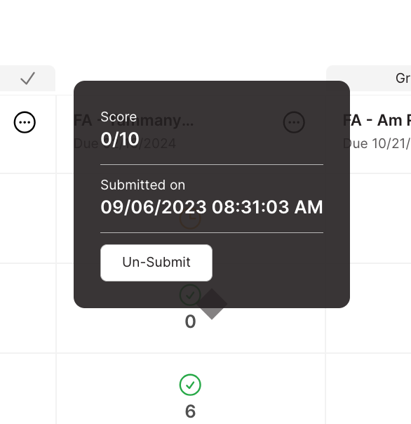
Now, if you ever want to unsubmit an assignment that is past the due date, you can. Before, teachers could only unsubmit active assignments, but thanks to your feedback, we’ve realized that sometimes that second chance comes for a student well after the assignment was due (I see you end-of-year make ups!). Hopefully, this will make it easier for the student to demonstrate their growth mindset and raise their scores! So teachers, just hover over any assignment that a student has turned in, and you can unsubmit it on their behalf.
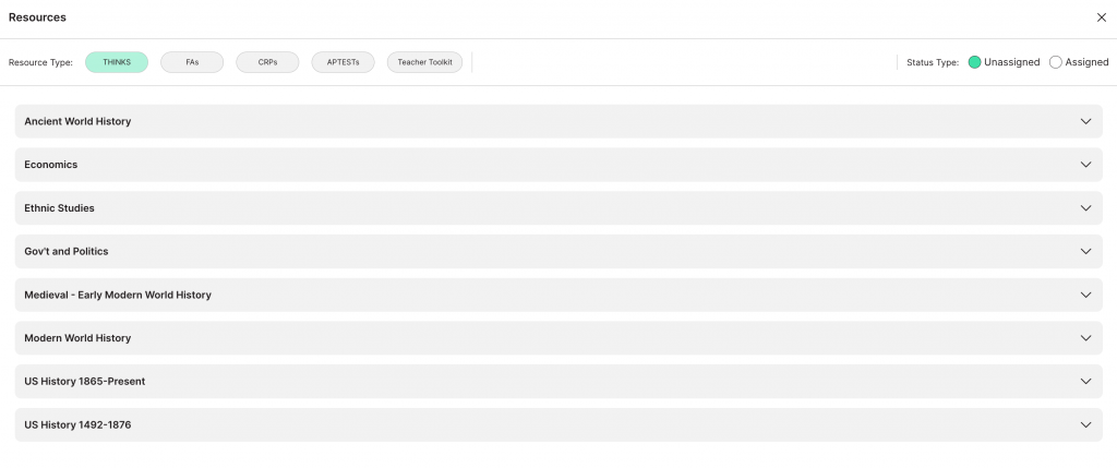
We’ve also made the resources tab a lot easier to navigate! With buttons and more visible drop down menus, we hope it will be easier for you to find that resource you were looking for! Also, stay-tuned, in the next couple months, this tab will go over a 2.0 makeover as we sort the resources by historical/content topic, rather than type of resource. We hope that it will help you see all of the types of resources for each corresponding topic, rather than having to hunt around for them on the platform. Once again, thank you teacher feedback!

Students, too, have a more streamlined experience. On their homepage, the layout is much easier to see, and depending on which sources they want to see, they can simply click the buttons on the top of their screen. If a resource type is in green, it will show up, if it is gray, it won’t be visible. Hopefully this can help students focus on the task they need to first, as well as sort through the assignments as the year goes on and the resources accumulate.
The “Notes” and “Chat” features are more visible and easy to use, too. For both teachers and students, don’t forget that you can annotate or ask questions via chat when working on any assignment on the platform. Notifications for the chat will always show up in the top right corner of your homepage.
As you navigate the platform refresh, you may notice other subtle changes not addressed here, but hopefully they all provide a more user friendly experience. And of course, we’d love to hear more feedback if you have it teachers. Just send a help desk ticket once on your portal and let us know what you want to see!